Uncovering the essence of a brand built to spark transformation
—
Founded 25+ years ago in the North Star state, SafeNet Consulting is a technology & business innovation firm that keeps clients moving forward—but the brand was starting to show a little age.
SafeNet's founders, Bob & Marty, wanted to cast a bold vision of the future to 250+ legacy clients, speak to the next generation of client leadership, & keep attracting the brightest minds in the consulting world. That is, while preserving the equity they’d worked hard to earn over two decades.
Our in-house team joined up with agency partner, Risdall Advertising, to refresh the brand's position, messaging & identity—taking SafeNet back to its roots as a creative transformation brand—& bringing their story of active consulting to life.
THE TEAM
Agency Partner: Risdall Advertising | Creative Direction: Pete Fabian | Video Direction & Production: Marty Miller | Art Direction/Design/Copywriting: Kaitlin Olson
Agency Partner: Risdall Advertising | Creative Direction: Pete Fabian | Video Direction & Production: Marty Miller | Art Direction/Design/Copywriting: Kaitlin Olson
WHAT WE DID
Brand Identity | Messaging & Positioning | Design & Copywriting | Logo | Print | Digital | Social | Environmental | Illustration | Iconography | Standards & Guidelines
Brand Identity | Messaging & Positioning | Design & Copywriting | Logo | Print | Digital | Social | Environmental | Illustration | Iconography | Standards & Guidelines
Breaking down a brand to its core ethos
—
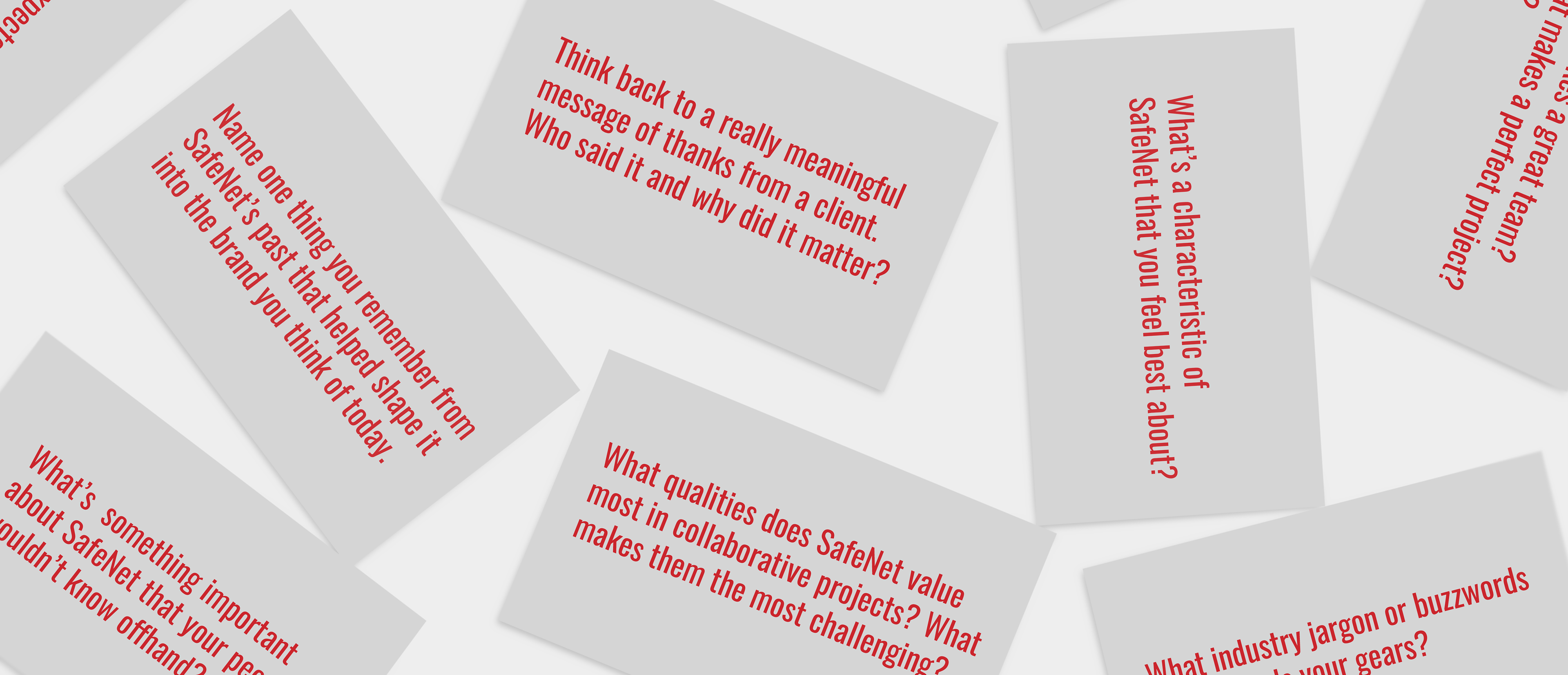
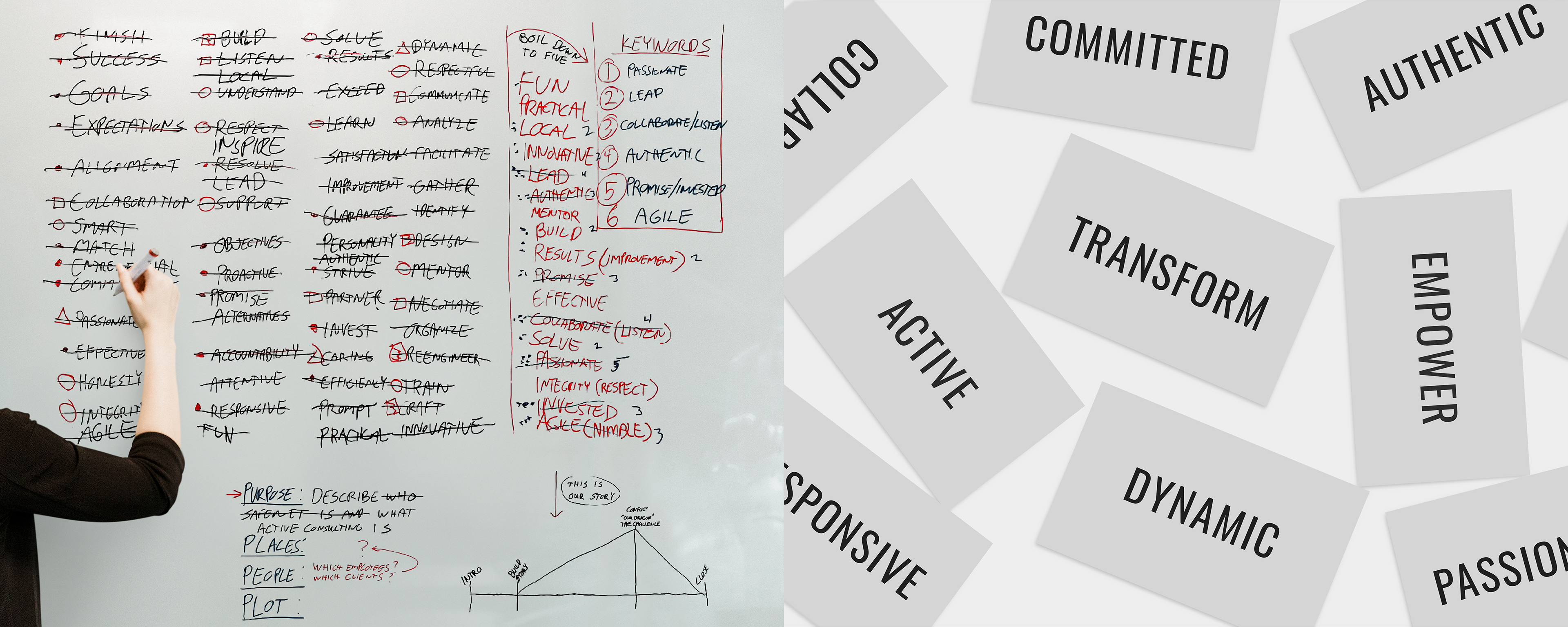
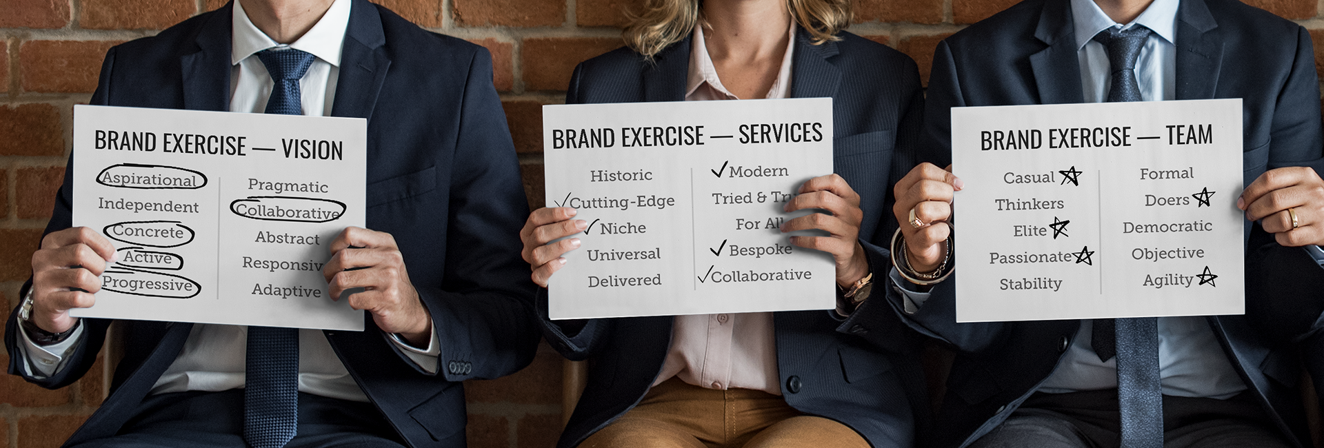
To kickoff discovery, we led a collaborative workshop with SafeNet's founders, executives, & top consultants—their passion for the brand was clear, but we needed to define the “why” behind it. We challenged their team to think beyond buzzwords to uncover their true North Star & how to best express it across the brand's messaging, story, value proposition & personality.
First, we boiled down how SafeNet earned such passion from their team of consultants: by connecting & inspiring them to mobilize around challenges with McKinsey-like know how & trademark agile process, SafeNet acts as a catalyst to take every consultant to the next level.
Second, we cut to how SafeNet really moves their clients forward. They aren’t simply another consulting team: they're cultivators of transformation, leading the charge as trusted advisers when the time comes to make waves. Whether that's through innovative tech or smarter capabilities, no two projects are ever alike with SafeNet.
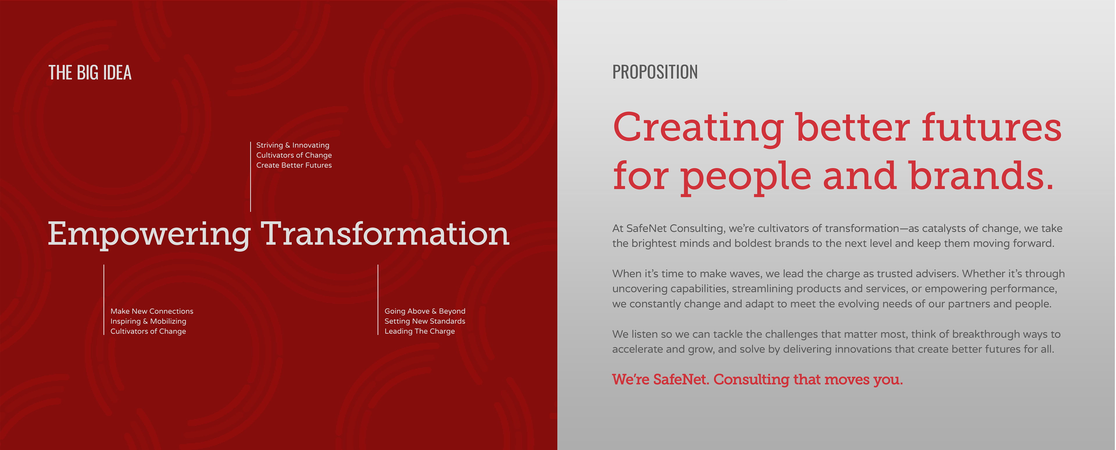
While the brand had long stood for moving forward, those insights pointed to something deeper: SafeNet creates better futures for brands & people alike. With a fresh focus on their "why", we aimed at what truly makes SafeNet great—its emphasis on empowering change.
Turning a brand's purpose into a true North Star
—
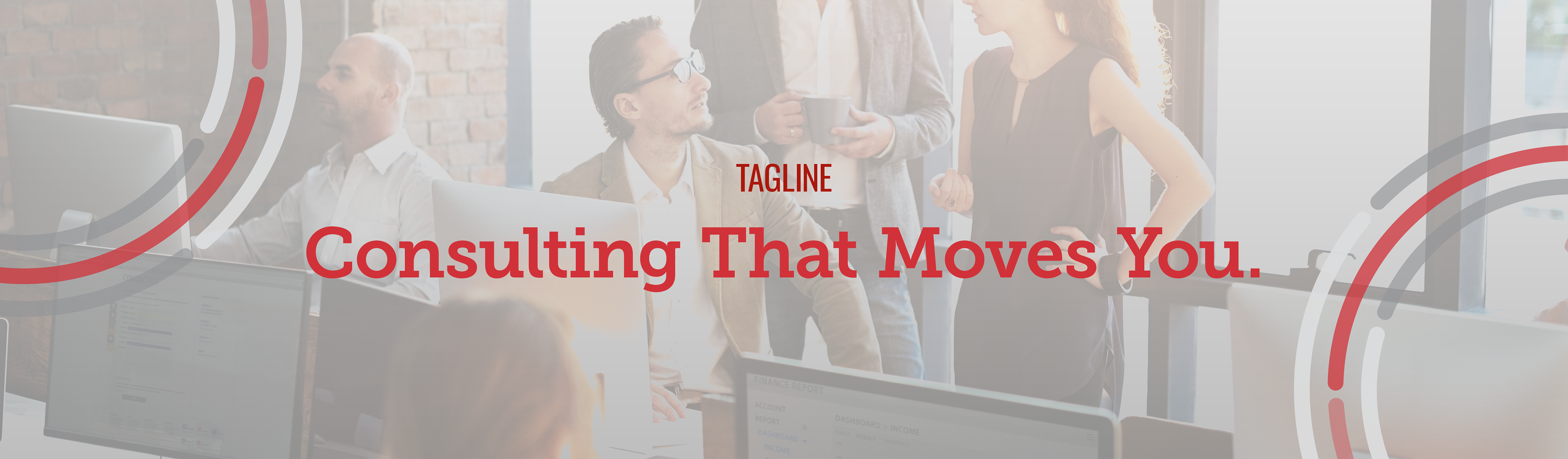
After our dive into discovery, we translated the team's insights into a tagline that rings true with SafeNet's big idea, that they are: Consulting That Moves You. Then, using the fresh tagline to charge ahead, we crafted a fresh position, purpose, value prop & messaging framework.
Positioning Statement
To shift their positioning, we created a fresh statement for SafeNet as a creative transformation brand, thanks to their capabilities—as an active, agile team—to adapt to an array of dynamic client challenges, segments & markets. It explains their dedication to pulling together the best of people, innovation & tech—and how their team plays a key role in moving clients (and each other) forward.
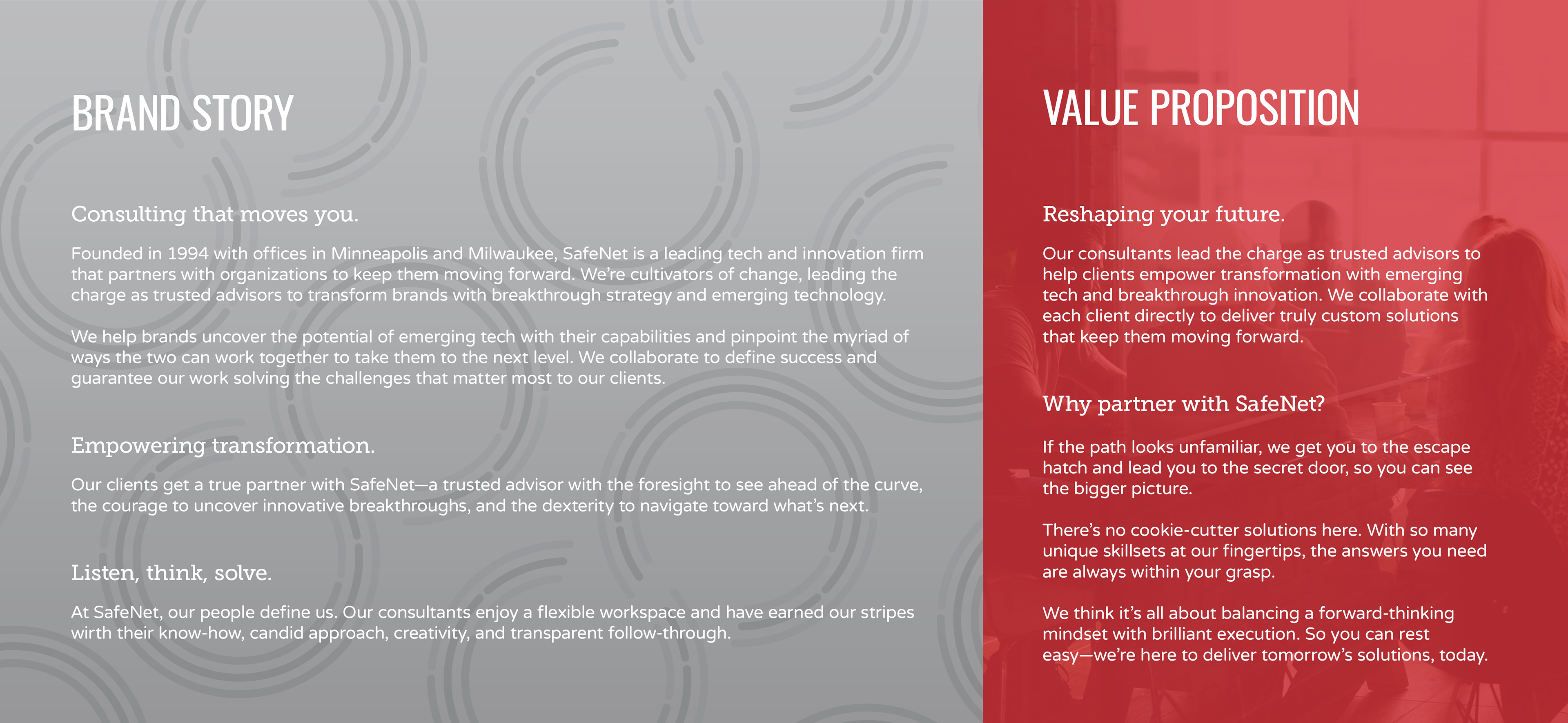
Purpose Story
Our purpose story declares that everyone has their ‘next’—and SafeNet gives brands & people what they need to get there. We further distilled the story into two words: Active Consulting. By combining leading technology and strategic innovation with the brightest minds, SafeNet transforms the ordinary into the extraordinary, helping brands grow & consultants thrive.
Value Proposition
Finally, we articulated SafeNet's proposition as creating better futures for people and brands by 'Challenging the status quo with active consulting'—seven words that encapsulate how SafeNet's capabilities are relevant to every business & enables the brand to reach every possible client despite the unique projects, and benefits, the provide with their bespoke services.
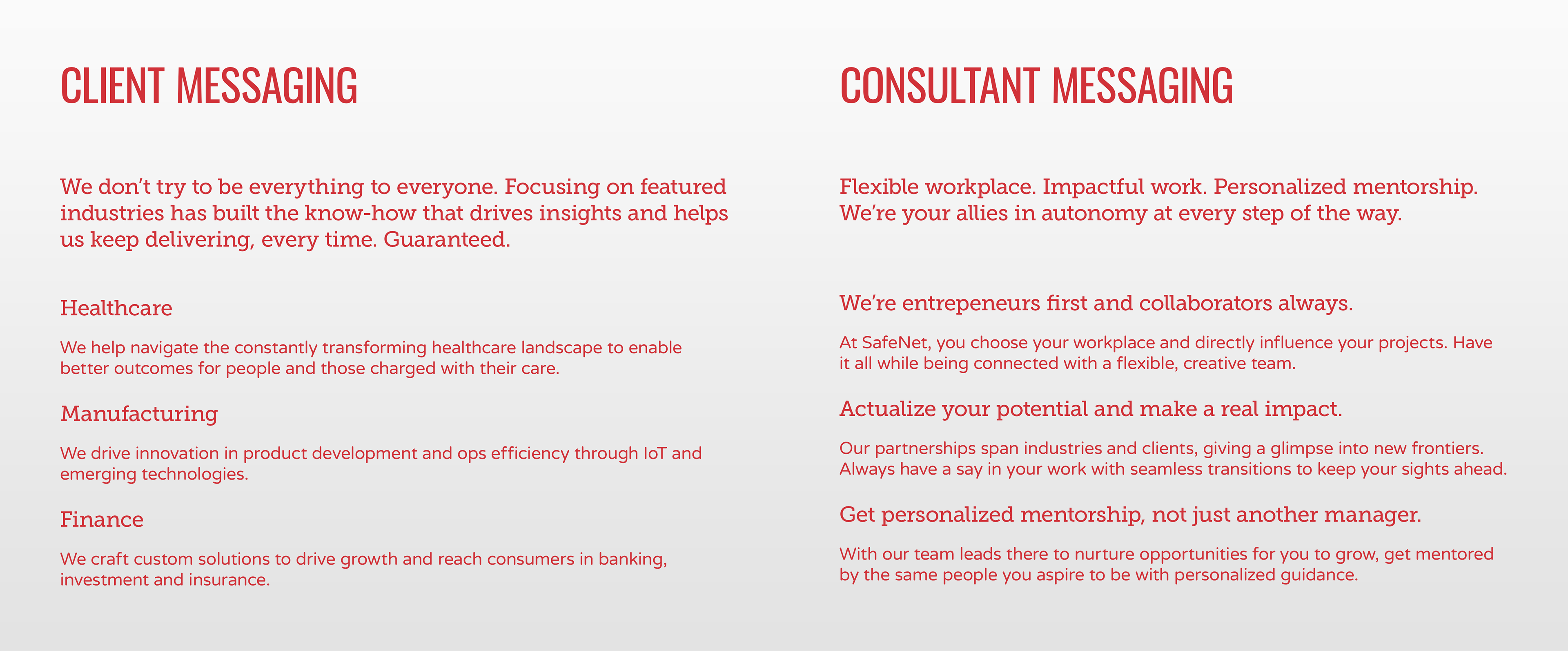
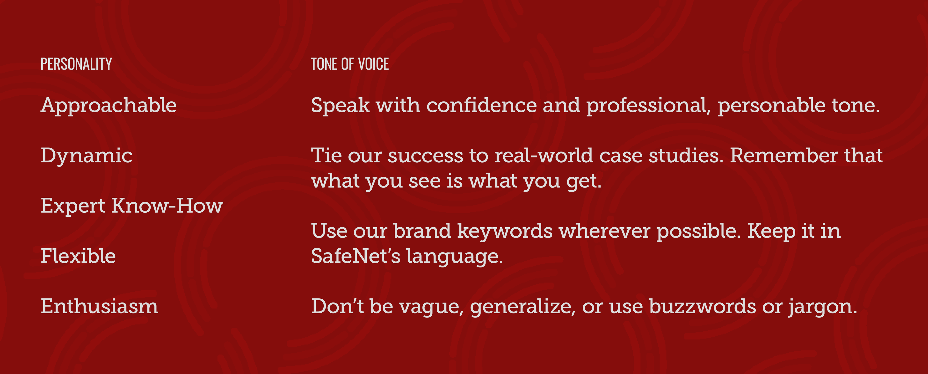
Messaging & Voice
Having uncovered what makes SafeNet tick, we created messaging to help them tell the world about their transition from market leader to market disrupter by focusing the conversation on creative transformation. The fresh tone of voice sits between too corporate & too gimmicky, an antidote to tired industry rhetoric with a balance of know-how & heart, as both a trusted leader & passionate rebel.
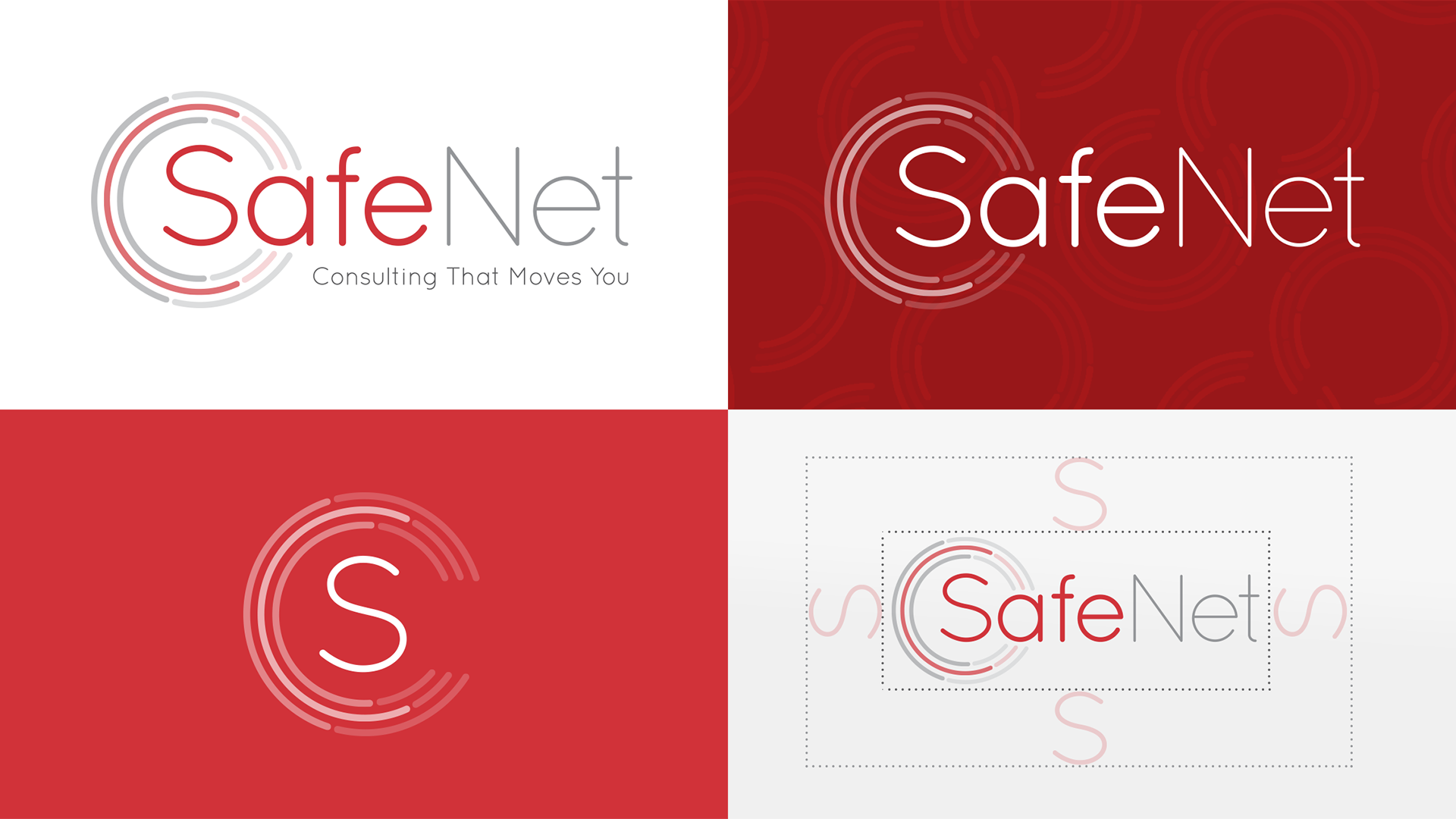
Evolving a heritage logomark for a dynamic future
—
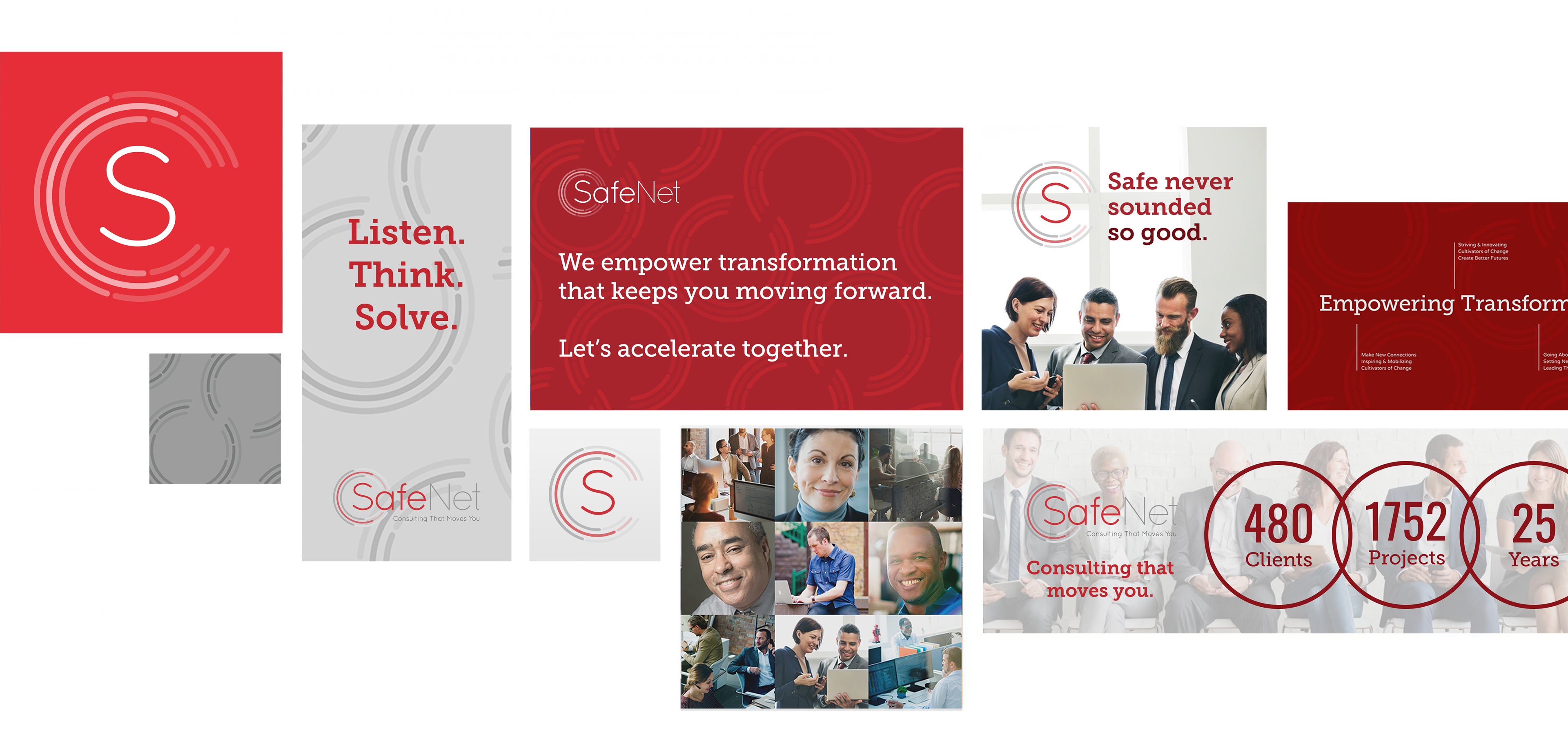
In ideation, we found the SafeNet logo's most potent symbolic asset: the circle. While always part of the identity, it'd been used with hundreds of variations. We chose a new take using brackets to make a bigger visual impact & turn the brandmark into a truly iconic symbol.
In composition, we explored several ideas before settling on the simplest, most direct expression of transformation—many parts coming together to form the dynamic whole. It’s designed to be a visual metaphor for SafeNet's dynamic spirit & how its people, partners, & capabilities come together—where parts don’t just add up—they spark, energize, & flex to become something bigger than its parts.
A fresh look & feel that sets the path forward
—
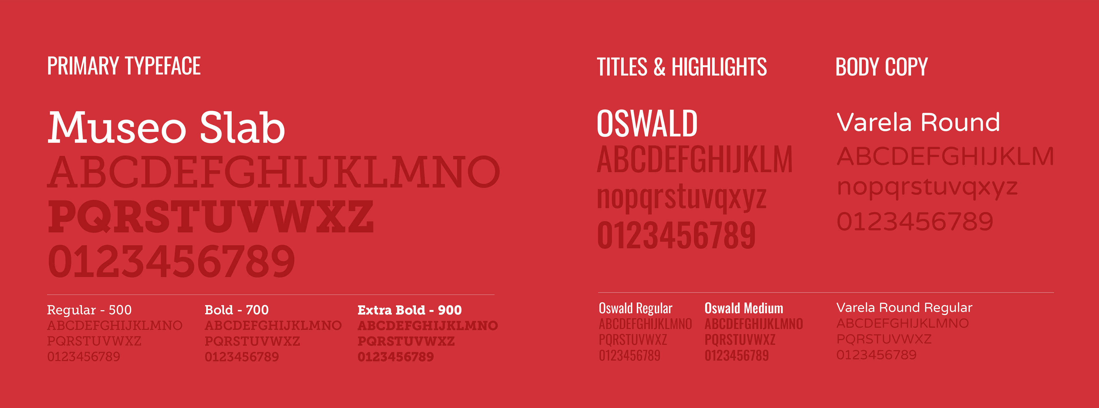
Typography
Varela Round provides a rounded, human personality as the primary typeface, while the addition of Oswald to the hierarchy imbues headlines with bold, contrast.
Varela Round provides a rounded, human personality as the primary typeface, while the addition of Oswald to the hierarchy imbues headlines with bold, contrast.
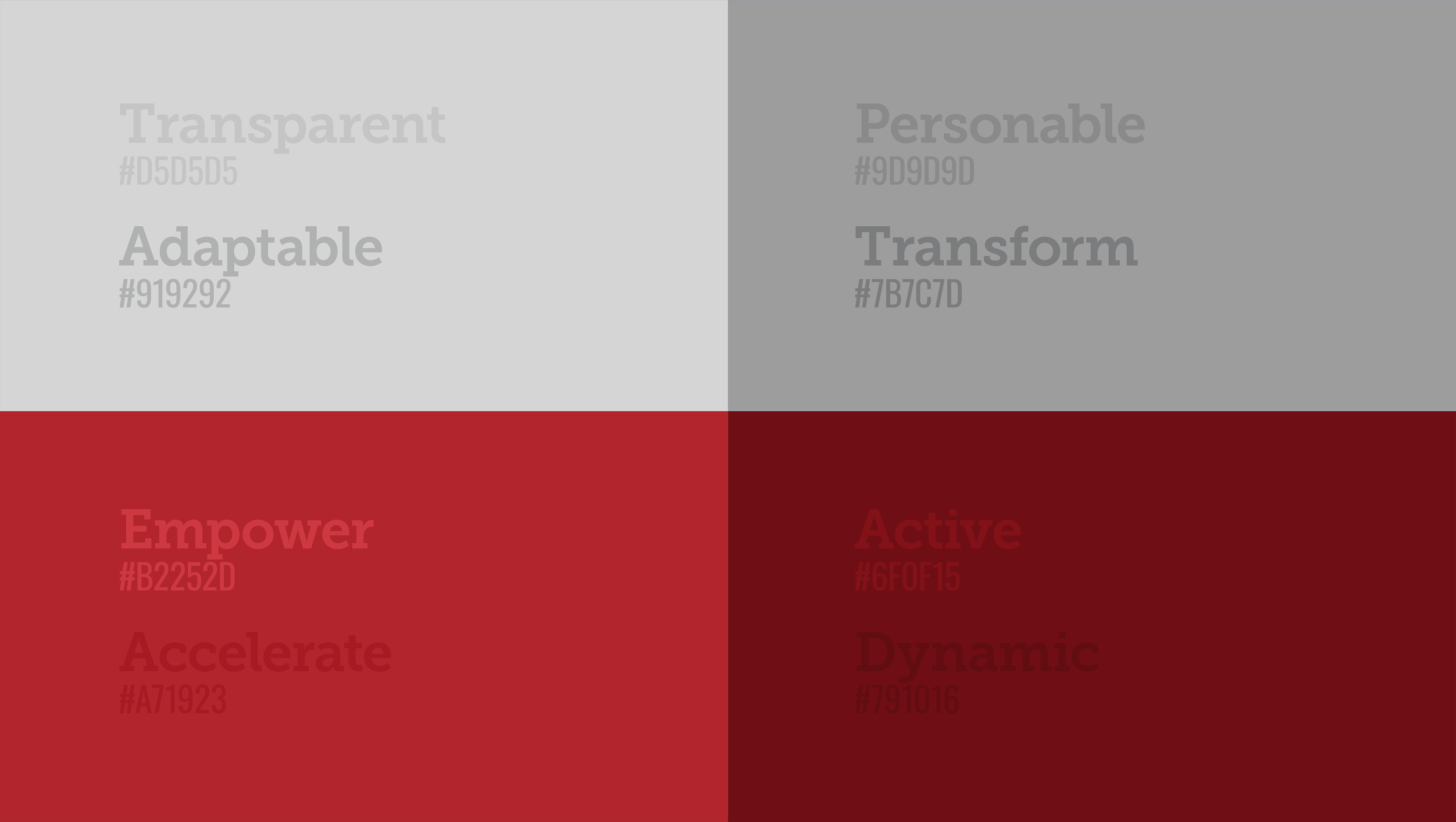
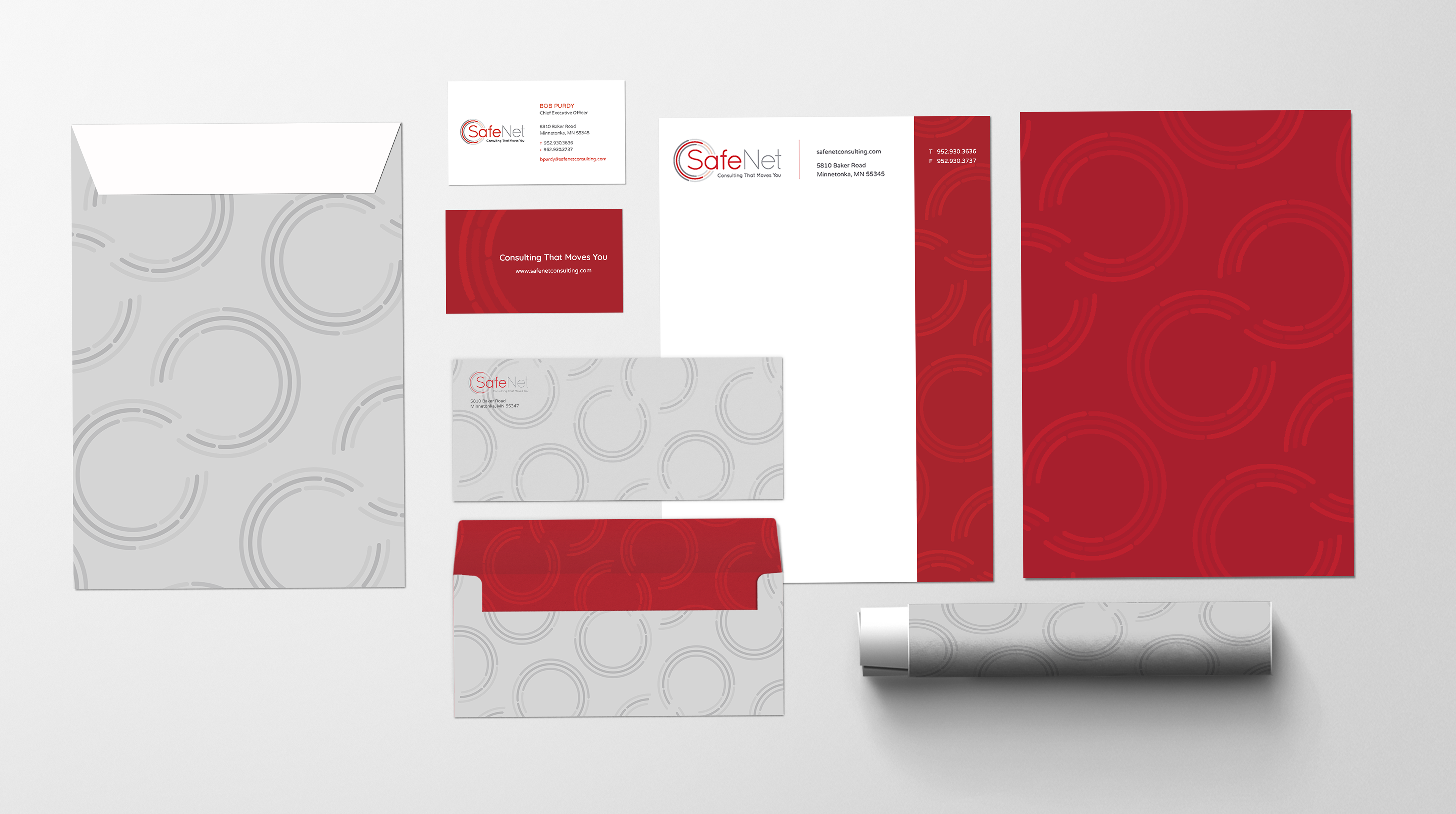
Color Palette
Across the category, other brand identities had been over-saturated with dated gradients & stale shades of blue. We flipped that convention upside-down with bold red & approachable grey to create a fresh look unlike anyone else.
Patterns & Elements
We expanded the visual identity across the brand experience with a series of patterns, illustrations, & graphic elements to communicate at every touchpoint.
Imagery & Style
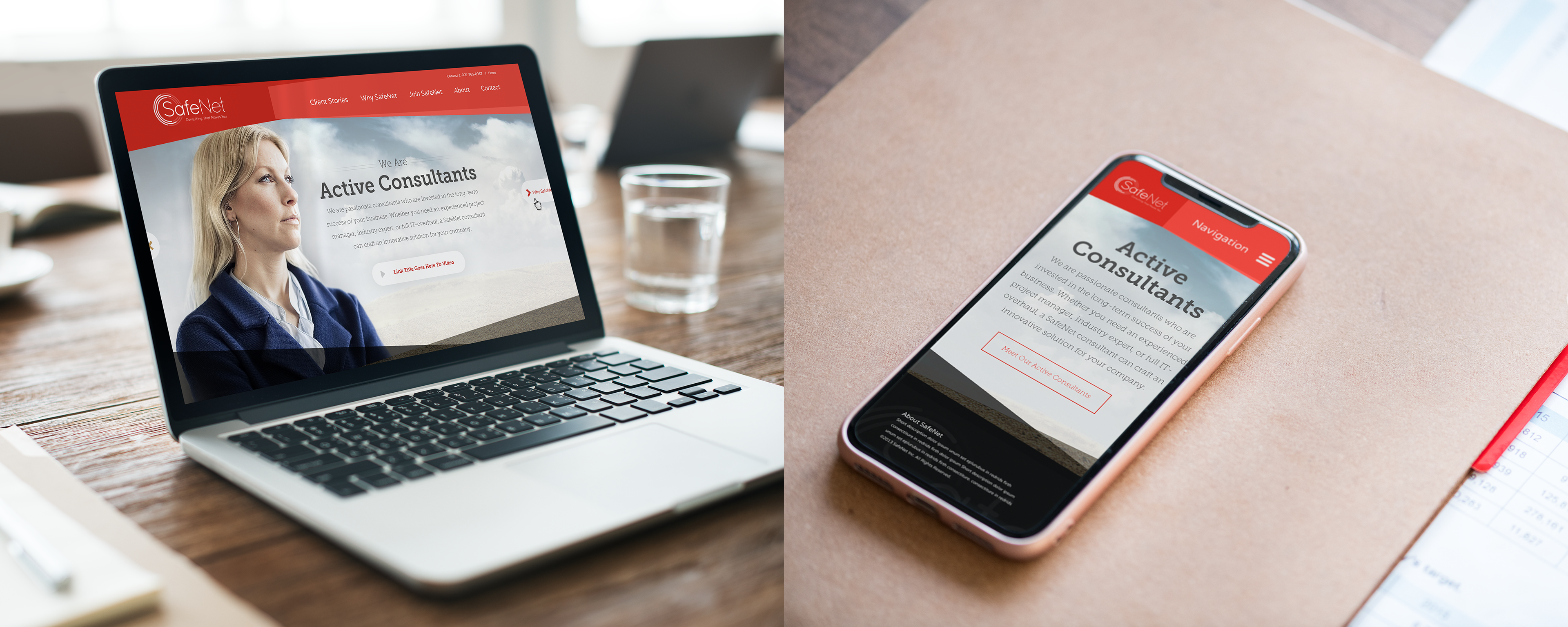
Defining the imagery style as aspirational & representing how SafeNet takes both clients & consultants to what's next, we created guidelines & a toolkit of custom photography to set the standard for the future.
Defining the imagery style as aspirational & representing how SafeNet takes both clients & consultants to what's next, we created guidelines & a toolkit of custom photography to set the standard for the future.

A dynamic extension across all brand touchpoints
—
We brought the identity's vitality to every aspect of SafeNet's brand experience: across digital, print, social, video & website. From the HQ office to each consultant's business cards, the refresh is modern & true to SafeNet’s DNA: dynamic, authentic & transformative.
SafeNet "Active Consulting" Storytelling Video - Courtesy of Foxtrot Studios
An award-winning brand transformation
—
After the fresh identity launched in 2013, SafeNet’s saw +49% growth in new business through 2017 & 95% brand appeal with key target audiences. To top it off, our website redesign, an extension of the brand refresh, won back-to-back WebAwards in 2013 & 2014 (see the full case study here).
Turns out, SafeNet's also become a top pick in the consulting world, being named a Best Place To Work & Top Consulting Firm by Business Journal and a 5x winner of the Top 10 Fastest Growing Companies award by CityBusiness. But we weren't surprised: SafeNet was built on the idea of empowering change for the better. More than ever, their clients & consultants know that they’re moving forward with the perfect partner at their side.